Everything your website needs, nothing it doesn't.
A website is one place a brand shows up. I document all of them.
Alongside the Hummingbird Hills website I produced a brand reference for the winery — logo files prepared for every use, a colour palette drawn from the artwork itself, a type system, and custom icons. A printer, a sign maker or a T-shirt vendor can match the brand exactly, years from now, without guessing.
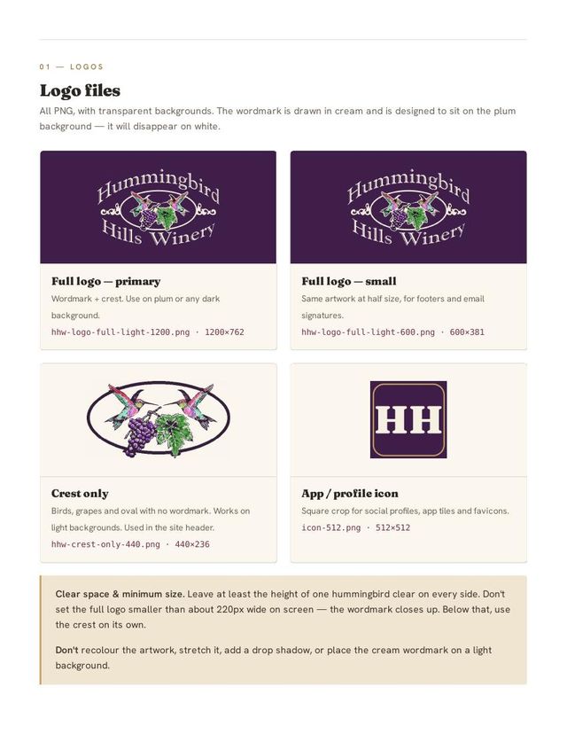
Logo files
Wordmark and crest, drawn in cream for plum or any dark background.
Half-size artwork for footers and email signatures.
Hummingbirds, grapes and oval — works on light backgrounds. Used in the site header.
Square crop for social profiles, app tiles and favicons.
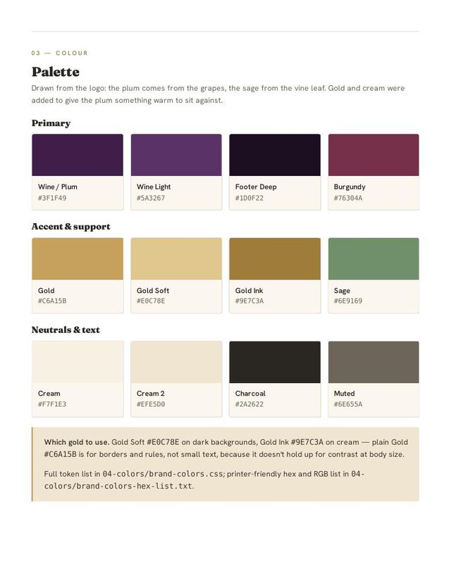
Colour palette
Drawn from the logo itself — the plum from the grapes, the sage from the vine leaf. Gold and cream were added to give the plum something warm to sit against.
Typefaces
Headings set in 600 with tight leading. Open-licensed, so the winery can use it on print, apparel and signage too.
Body copy at 400; buttons and labels at 600 with wide letter-spacing. Also open-licensed.
The reference document
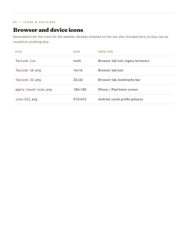
The winery owns this document outright, along with every file in it.
A second system — Lucas' Army Foundation
The foundation came to me with a logo and nothing else. I built the identity out from it: the ember orange is pulled from the star and lettering, army green gives the site its backbone, and gold and parchment keep it warm rather than harsh. Ember orange is reserved for one job — the Donate button.
Bold, uppercase, set tight.
Body copy at 400, buttons and labels at 600.
Military stencil face, used sparingly.
Logo files at four sizes, a full favicon and app-icon set, web fonts, the palette in CSS and printer-ready HEX/RGB, and a printed reference guide — all handed over to the foundation.
Not sure which you need?
Tell me about the business and I'll point you at the right one.
Start Your Project →